"We weren’t actually in the market for a new home" – Whangārei House in Home Magazine
17/4/2024
Open Space
Perched atop an escarpment overlooking Whangārei’s town basin, this home is the embodiment of the owners’ vision, the architects’ knowledge, and the builder’s expertise.
Whangārei House designed by John Melhuish featured in the April 2024 issue of Home Magazine. We've republished the article here.
Small, cliffside sites aren’t uncommon in Wellington, and the practice has plenty of experience in designing homes for these sites,” says John. “However, that didn’t mean that this would be an easy task."
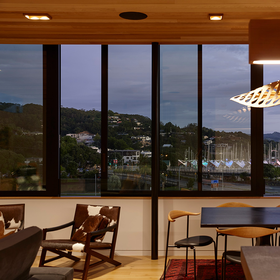
“We weren’t actually in the market for a new home when we spotted the ‘For sale’ sign while out walking one morning,” say the homeowners. “However, the minute we saw that view across the basin, taking in the Hundertwasser Art Centre, we were sold.”
With the property secured and the existing leaky home removed, the next step was to create a family home on the 379 square metre site. Given the complexity of designing a home on the edge of a cliff face, the owners turned to Wellington-based architect John Melhuish, director of Herriot Melhuish O’Neill Architects and an associate of the couple.
“Small, cliffside sites aren’t uncommon in Wellington, and the practice has plenty of experience in designing homes for these sites,” says John. “However, that didn’t mean that this would be an easy task.
“The site threw up a couple of additional constraints in the form of existing sewerage and stormwater pipes. Luckily, we had one massive advantage in our favour, which was that the site was being rezoned to mixed-used.
“This meant we were able to really push the height-to-boundary setbacks, which, with the help of some architectural ‘gymnastics’, allowed us to design around these constraints and still deliver everything the homeowners had asked for — including a swimming pool.”
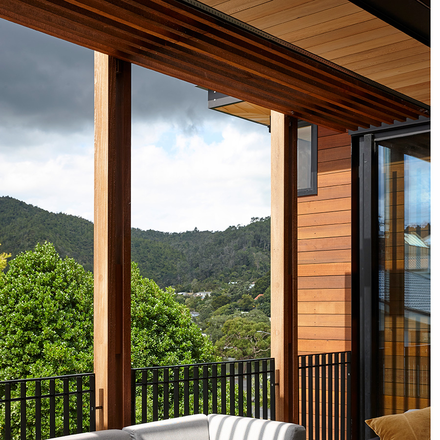
The homeowners’ brief called for three bedrooms, an open-plan kitchen, dining, and living area, along with a separate TV lounge, the aforementioned pool, a wine cellar, indoor-outdoor entertaining spaces, and a lift.
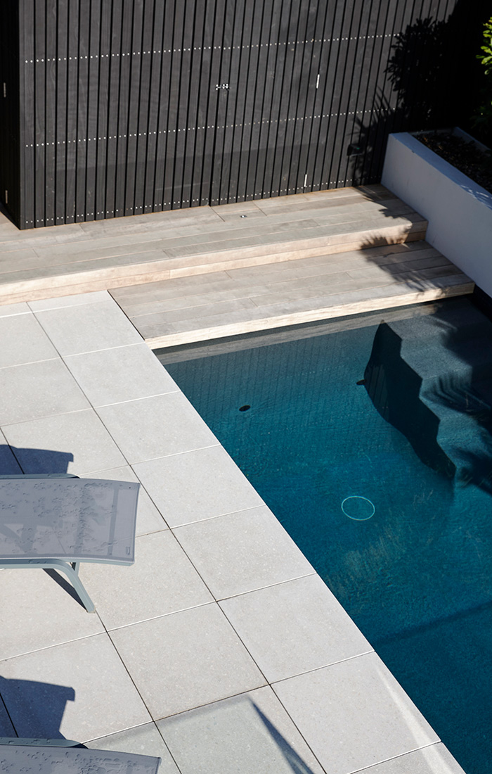
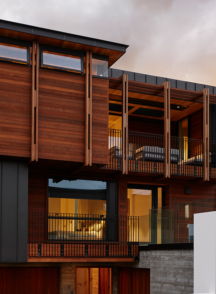
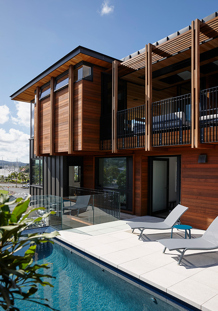
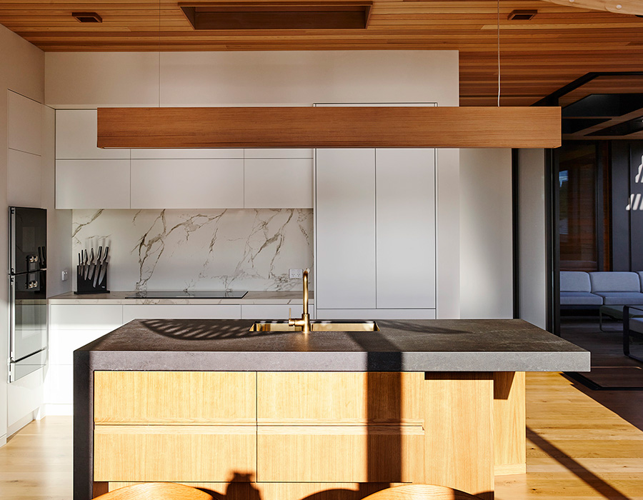
“It quickly became apparent that the only way to deliver all of this was to take the home to three storeys,” says John. “Thanks to the favourable setbacks, being able to build to height meant we could put all the entertaining areas on the top floor, leaving the mid-floor to house the bedrooms and the pool terrace, with garaging, storage, and a wine cellar on the ground floor.
“We managed to get everything in there, and, in taking advantage of the ‘air space’, we were able to cantilever a portion of the footprint over the stormwater drainage, solving one of the biggest constraints.
“Of course, the design is only the start of the process; the build is where you’ll find the proof of the pudding. We were very fortunate that the homeowners had done their research and had found an extremely good builder who did a great job of bringing the vision to life.”
John’s sentiment was echoed by the homeowners.
“This home is such a tribute to the skill and expertise of Richard and the whole RHJ Builders team,” they tell us — “and not just as builders, either, but also in the way that Richard navigated the relationships with council and with the neighbours, as well as us, throughout the entire build process.
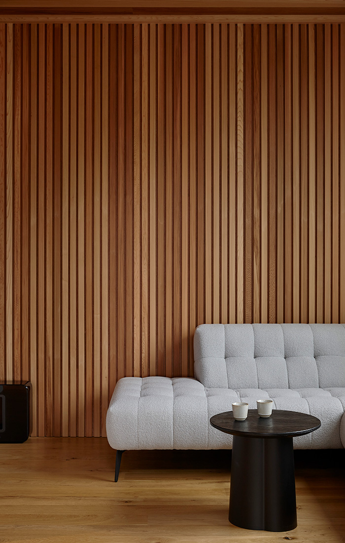
I’m pleased with the way it came together; the composition works really well. Even when you’re looking at it from town, it’s not overbearing; the darker tones mixed with the raw material palette help to pull it back from the edge,” John Melhuish
