Fabulous Interior Fit-Out for FNZ: HMOA Interior Designer, Karin Thurston
11/11/2019
HMOA has just completed a three year project to restrengthen, restore and refurbish Wellington’s heritage-listed Harbour City Centre annex.
Neglected for many years, the Harbour City Centre annex was once home to the DIC department. Global financial technology company FNZ has taken the tenancy across all three levels for their new New Zealand HQ. We caught up with HMOA interior designer Karin Thurston, who worked with Max Herriot and Oliver Markham on FNZ's stunning fit-out.
Karin, this is a large project for a Wellington interior fit-out, how did you approach it?
In the US, I worked on a number of open plan workplaces of a similar scale. Even though New Zealand has a slightly different work culture, most large-scale businesses around the world work in a similar way. A successful open plan office needs to integrate enough meeting spaces of varying sizes and types to allow for a productive work environment.
Working with Max and Olly, I really enjoyed the collaborative design process. Each of us added our own expertise and came to a consensus on approach. My specific role was in space planning, design, joinery, lighting selection, as well as the all the furniture and finishes.
How did you differentiate between the three floors?
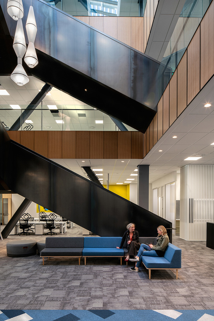
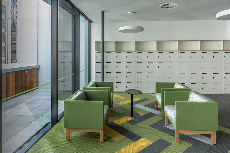
We wanted to create some continuity between the three levels, while also giving each its own identity. Each floor has a similar layout with the different-sized meeting rooms mostly located in the same area on each.
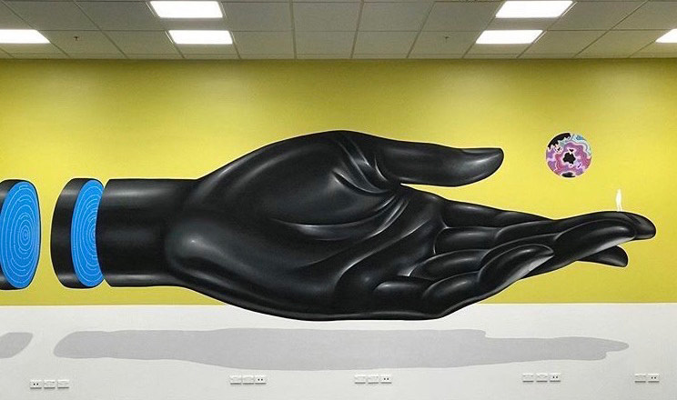
Colour is used to define the floors and there is a large artwork on the back wall of each, commissioned from local artists Gina Kiel, D Side and Sean Duffel. Unique art adds so much to the character of an office and it's a clever way of adding life to the darker areas.
We originally had an orange scheme for the middle level but were told that an FNZ employee has a strong aversion to it! So we changed it and I think in the end, it’s worked out just how it should be.
Was it difficult to incorporate the heritage aspects and get light into the spaces?
It was a challenge to marry new materials into a 100 year old structure, many aspects of which have been restored and re-strengthened.
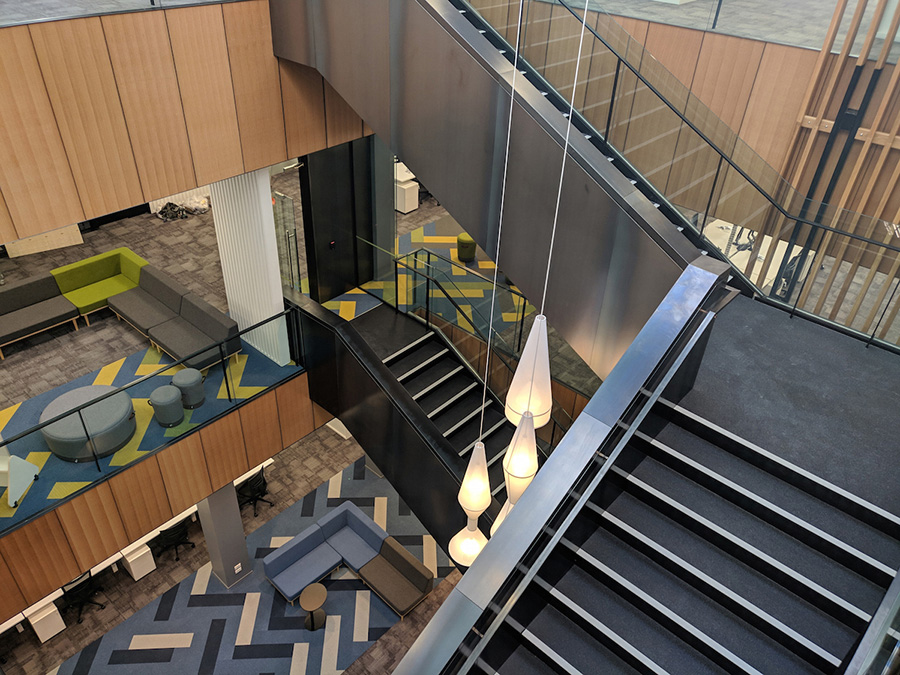
The team doing the base build (HMOA’s Corey McMeeking and Max Herriot alongside LT McGuinness) did a great job in incorporating the beautiful skylight and large internal stair through the centre of the space—it keeps it all feeling bright and airy.
We laid out the office space so that each of the FNZ working groups has some natural light, and doesn’t feel like they are separated.
Who are FNZ and how were they to work with?
FNZ is a Kiwi success story—founded in Wellington in 2004 by New Zealander, Adrian Durham, it’s a global financial technology company that now employs over 2000 people worldwide. The corporate headquarters moved to Edinburgh in 2012 and Durham is now based in London as CEO. FNZ’s New Zealand HQ is just minutes from its former home in Lambton Quay, which was a tired 80s office.
The FNZ team has been great to work with. They trusted us in the design and finishes, and it shows in the final product.
FNZ has done such a great thing for their employees—investment in a quality workplace is really an investment in their people.
Did you get everything you wanted?
There was some furniture we initially selected that didn’t make the cut due to cost, but generally we were careful to make selections that we knew would not go over budget. We also didn’t compromise our own standards on finish, quality and sustainability.
Much of the furniture is New Zealand-designed or made and of natural materials—timber and metal in lieu of plastic products. The fabrics are mostly wool, linen or cotton.
What’s your favourite part of the design?
The large café space with its beautiful American white oak timber wall and kitchen, and the boardroom. I think it all came together and LT McGuinness did a nice job on the finishing of that area.
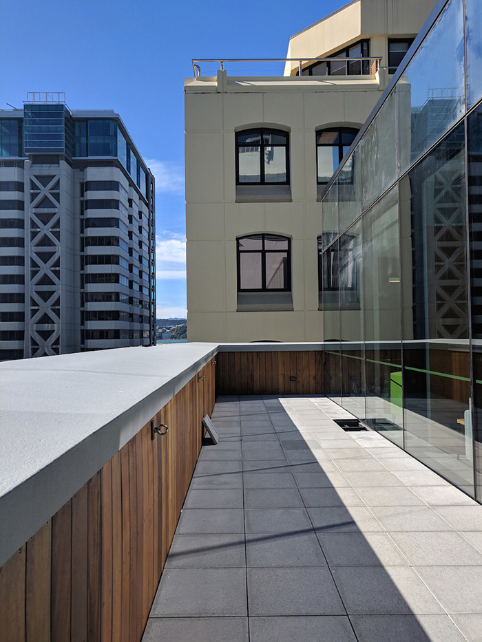
I can only imagine the wonderful gatherings FNZ will have in the café space with its amazing outlook onto the outdoor terrace.
The natural moss insert wall panels in the café are a product from OutsideIn, I liked the idea that it doesn’t require maintenance and it adds a nice softness to the space. Plants in an office are an important part of creating a healthy environment for everyone working there.
I hope that FNZ really enjoys what we’ve created for them, and feel good about coming to work each day. It’s important to create happy and healthy environments that have a balance of spaces for productive working, and enjoyable breaks.
HMOA also worked with Light Studio, Europlan, Zenith and Tim Webber Design.
Photos: Andy Spain and Francis Lim

